UX Workshop
As part of the thesis course schedule, on March 8th, I was part of a User Experience Workshop with my peers and the UX Designer Shombit Chatterjee. This event was particularly meaningful because it was the first time I received feedback from peers on an actual design iteration for LanguageBug.
Reveal.js
At that point, I had just chosen Reveal.js as my prototyping platform. In its essence, Reveal.js is a presentation framework, not a prototyping tool. Therefore, unlike any actual prototyping tool, Reveal.js does not have:
- a graphical user interface (GUI), which means that all of the development had to be done using HTML5, CSS and JavaScript.
- built-in graphic assets (buttons, icons, etc.), and
- mobile function pre-sets (sliding, side menu, etc.)
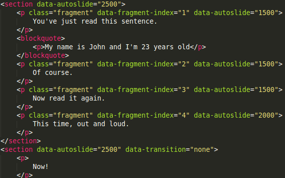
Image 11 - Prototyping through Reveal.js
On the other hand, Reveal.js offers some valuable affordances, which is why I had chosen it as my primary tool for the moment:
- It allows for responsiveness to almost any user action,
- all aspects of the prototype are completely flexible and customizable,
- unlike most prototyping tools, it supports integration with audio files,
- it runs on any browser and platform, just like a regular website page.
My questions
Still unsure about the efficacy of Reveal.js in this context, I was looking for feedback on how to make the usability of LanguageBug align with the majority of apps.
I was wondering at the time:
- Is my prototype intuitive? Is it easy to use?
- Why doesn’t it look/feel like a mobile app?
I was also questioning if my prototype would engage users or not. My questions were:
- Will my peers respond to the command prompts?
- Is the flow of texts happening too fast?
- Will they be confused by so much information?
- Does my prototype make it clear where I’m heading to?
My assumptions were that following the design was not intuitive and that learner would need to process most of the information in the sensory memory. I was also assuming that user might constantly think “where should I click?” and “would I need to press anything while speaking?”, so that these concerns would affect their learning efficacy.
My presentation
The only section of LanguageBug I had prototyped was the Speak Fast principle. Principles are a set of practical instructions given in English to scaffold users on how to best operate the LanguageBug app.
The particular purpose of Speak Fast is to make learners speak aloud at a challengingly fast speed according to the application prompts.
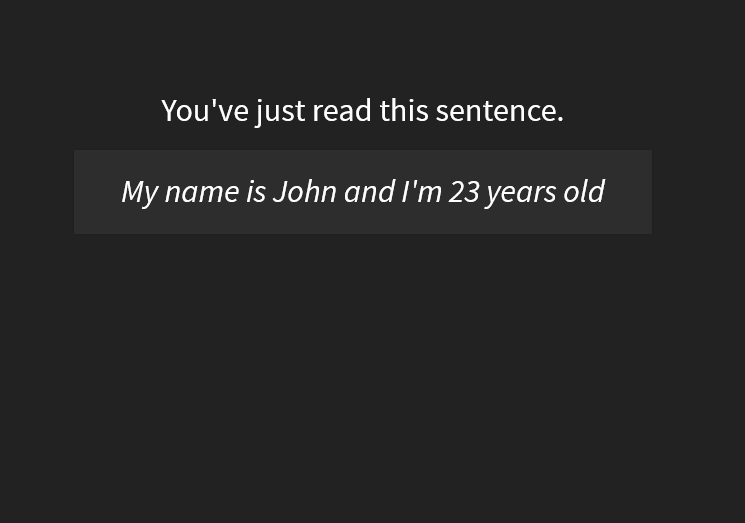
Image 12 - Initial screen on Reveal.js: a statement without instructions
My peers, who have never seen me teaching using those strategies, opened this prototype and immediately began to follow its instructions. Quickly, they began to respond to the prompts by speaking.
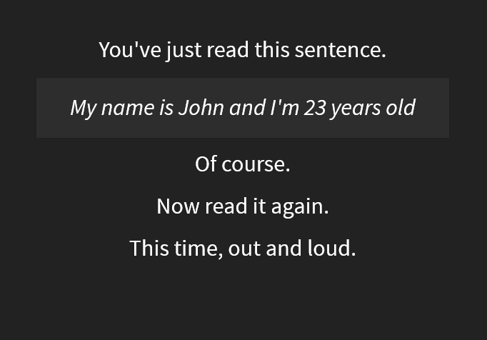
Image 13 - 2nd screen on Reveal.js: first command instruction
As the principle practice continued, they reacted appropriately to the new prompts and began to speak all those words louder and faster. The whole test lasted only about 30 seconds, but was extremely effective.
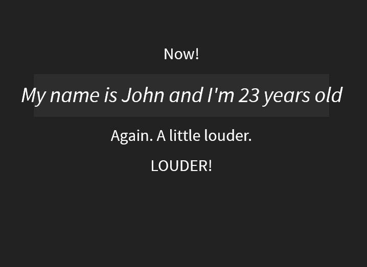
Image 14 - 3rd screen on Reveal.js: reinforcing instructions
Feedback
I was very surprised and satisfied with what I was seeing! My peers had immediately engaged with my prototype and looked very excited about that whole experience. Their enthusiasm and compliments were crucial to solving my doubts and relieve my initial fears:
- My prototype is intuitive and easy to use.
- Not looking like a common mobile app does not seem to be a problem.
- My peers have responded to the command prompts with enthusiasm.
- Too much information increased their focus and was not confusing.
Most importantly, the overall purpose of my thesis project finally became clear to them, after months of unsuccessful theoretical conversations. It also became clear to me the importance of prototyping as much and as early as possible.
Conclusion
The participants of that workshop highlighted a few design issues and made some suggestions, such as:
- The flow of instructions and content was probably too fast for most users, therefore it could be helpful to make it adjustable,
- the formatting of the instructions should differ more drastically from the formatting of the sentences so that users could immediately differentiate them.
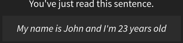
Image 15 - Before workshop: content/instructions distinction

Image 16 - After workshop: content/instructions distinction
These and other suggestions were really helpful and guided the next steps of UX development. On the other hand, these issues seemed to have minor importance in comparison to how happy I was feeling after having my design intentions approved by my peers.