Prototype
The design idea presented in the prototype follows the idea of a very clean interface, so that the user does not experience distractions in his/her studies and can better focus on the activities. The color pallet consists of light blue, white, black and light grey. Watercolor is used as the APP aesthetics, creating both abstract bugs and giving the overall appearance a better look.
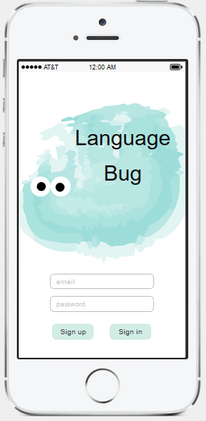
1. Sign up/Sign in
User can register into LanguageBug or simply connect his account in his phone.
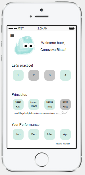
2. Dashboard
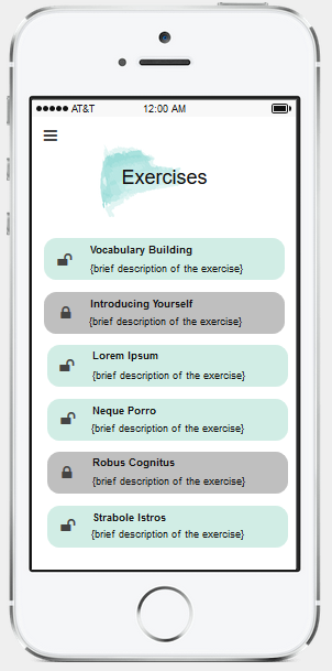
3 Exercises page
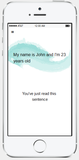
4. Principle Page
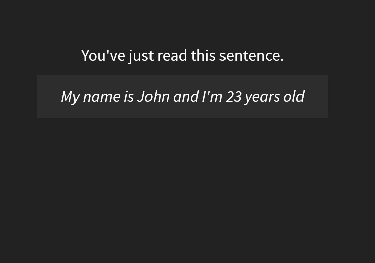
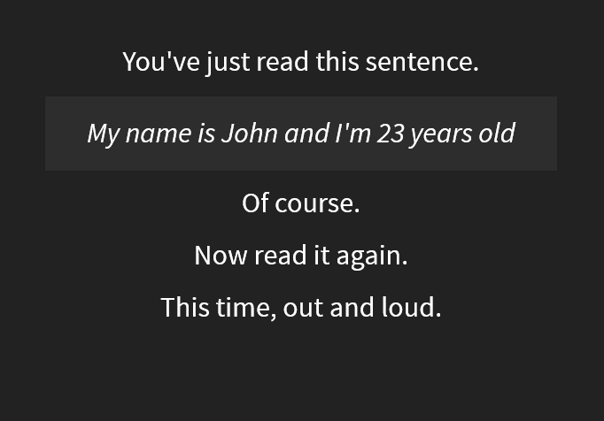
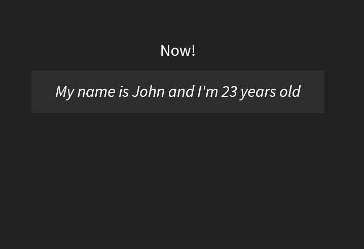
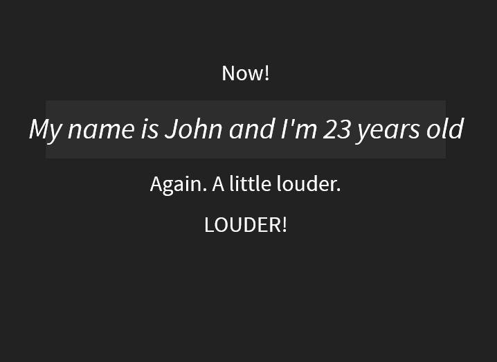
Both the principles and exercises follow the same structure: dynamic instructions asking the learner to perform something specific. Images A, B, C and D represents the Speak Fast principle, prototyped on Reveal.Js. The line “My name is John and I’m 23 years old” is always at the screen, even though the instruction lines (such as “now read it again”, “this time, out and loud”, …) are constantly changing, in a setup time programmed by the APP. In this way, the learner has to be focused and keep the fast pace the APP suggests, while speaking out loud what is shown on the screen.
Image E represents the same principle structure, but made on MockingBot, following the APP design
Exercise page
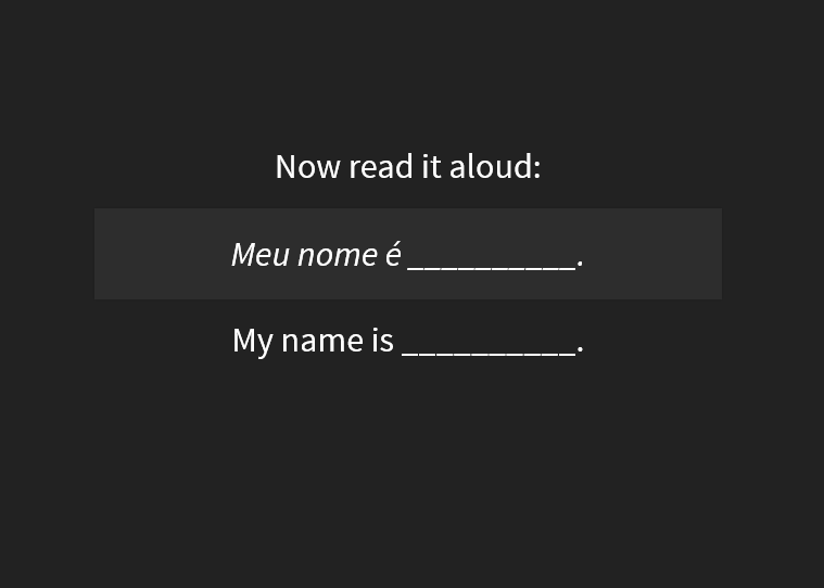
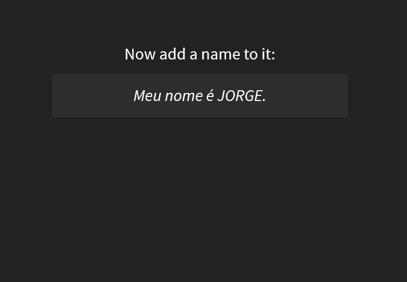
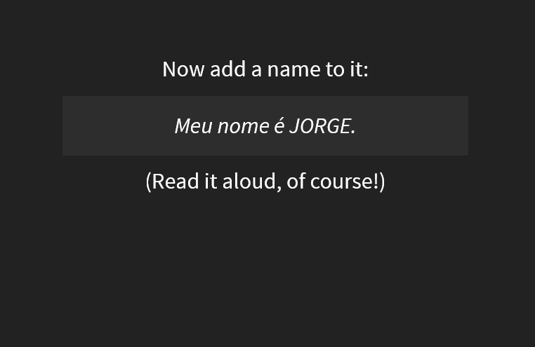
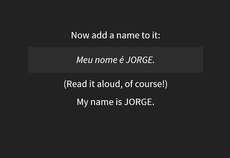
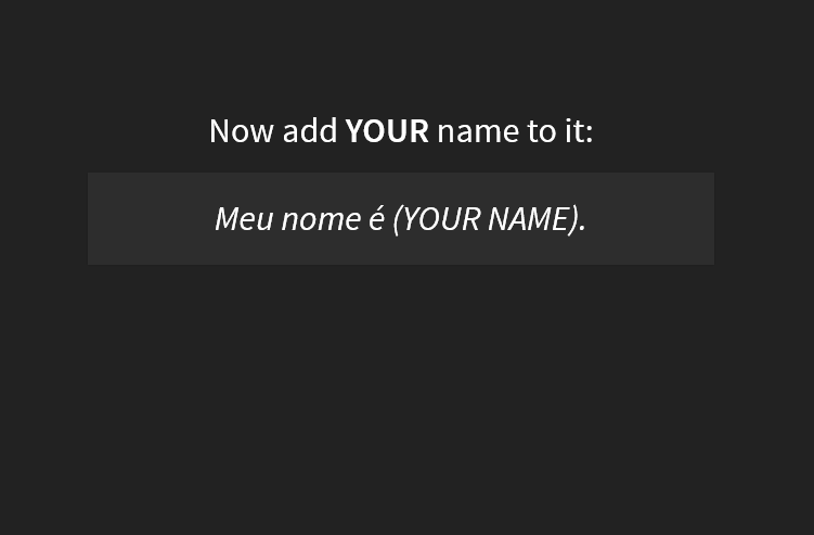
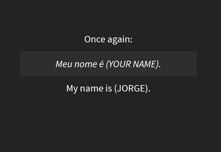
The exercises follow the same structure as the principles: phrases in Portuguese that are frozen on the screen and dynamic instructions telling the learner what he/she should do. In this example, images G, H, J, K asks the user to say the phrase “Meu nome é (your name)” which means “My name is (your name)”. Learners listen to an audio to understand how to pronounce it and then they follow the instructions, reading the phrase lots of times, and with a fast pace.