Blog#1 Is Duolingo really the best we can do?
Duolingo is a “free language-learning and crowdsourced text translation platform”, says its entry on Wikipedia. As of January 2014, Duolingo had 60 million users, out of which about 20 million are [were] active, according to Forbes Magazine, which adds that “Duolingo remains free of charge. No advertisements. No subscriptions. No upsells. No in-app purchasing”.

As always, the promise is broad, ambitious, and vague: to learn languages.
But who is the student population that will use Duolingo? Anyone, once again. Most of the online services dedicated to learning that I know are open to anyone that has access to Internet. It can can be viewed in different languages, it has a light design and it is completely free. So you don’t need to have a lot of money, a powerful computer, or to know any specific language to start using Duolingo.

Great design, with a cute character and gamification.
The purposes also vary a lot. Teachers may use Duolingo to assign home practice, or they can use pieces of it in the classroom. For example, if I wanted to teach my students some specific vocabulary, it’d be much easier to open, let’s say, Duolingo’s section on Animals in Portuguese, than spending a lot of my own time creating my own slides and presentations with pictures of animals.

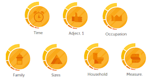
Many different contents, separated by units.
If you intend to learn or practice a foreign/second language at home and by yourself, Duolingo can be even more useful. Their entire experience is designed for individual learners, so Duolingo will probably be much more effective when people are taking courses by themselves. Just like this little guy in the video below, who learned English by himself in only eight months. Incredible, right?
Go to 2:50
I’ve tried Duolingo many times over the past years. As a language enthusiast, a former language teacher and, now, a language learning tool designer, it’s very often that people come to me and say: “Oh, Gui, you should try Duolingo, have you heard of it? It’s great!”. However, I could never get a sparkle of excitement about it. But why?

Isn’t it exactly the same as Rosetta-Stone or Livemocha?
Well, maybe, the reasons is behaviorism. In my opinion, that’s all Duolingo is about, just like other platforms such as Rosetta-Stone and Livemocha. In other words, it’s basically the same exact, limited view of what Language Education is, but with a whole new, fresh, appealing design idea, that makes people (and designers) excited.

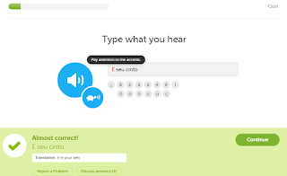
Basic functionality of Duolingo.
You don’t need technical support do use Duolingo. Indeed, you barely need a mouse, since their design is so great that you can navigate through the lessons and exercises by only pressing the keys on your keyboard. Oh, and of course, if you ever need any help with anything (even though it’s all super intuitive), there’s an excited community of users willing to troubleshoot.

I have never said this sentence in Portuguese. Why would someone learn that?
In my general assessment, Duolingo is the best that exists out there. It’s 1000x better than Rosetta-Stone, Livemocha, Mango Learning, or anything else. The reason? The network effect: Duolingo has millions of users that are well-connected. This is how Duolingo makes money, this is how it gets better, this is how new users arrive.
I acknowledge that Duolingo has the cleverest business model in online education I’ve ever seen, in addition to their nice user experience and graphic design. However, their methodology and their view on language learning itself is just the same as always. That’s frustrating, but also encouraging: I’d love to create something better.
